SAP Homework Sheet
Author:
Argelia Gonzalez
Last Updated:
7 yıl önce
License:
Creative Commons CC BY 4.0
Abstract:
Analysed Data

\begin
Discover why over 25 million people worldwide trust Overleaf with their work.
Analysed Data

\begin
Discover why over 25 million people worldwide trust Overleaf with their work.
\documentclass[12pt]{article}
\usepackage{graphicx}
\usepackage{hyperref}
\usepackage{enumerate}
\usepackage{sectsty}
\usepackage{breakurl}
\usepackage{setspace}
\usepackage{float}


\topmargin -0.7in
\textwidth 6.5in
\textheight 9.5in
\hoffset -0.6in
\parindent 0in
\parskip 0.08in


\allsectionsfont{\sffamily\normalsize}

\title{SAP Business Objects Assignment}
\author{Argelia Gonzalez}


\begin{document}

\maketitle

  \begin{enumerate}[A.]
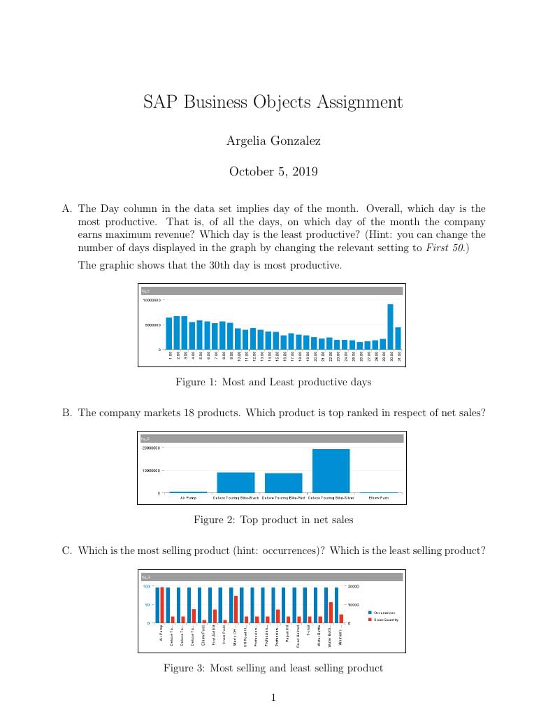
  \item The Day column in the data set implies day of the month. Overall, which day is the most productive. That is, of all the days, on which day of the month the company earns maximum revenue? Which day is the least productive? (Hint: you can change the number of days displayed in the graph by changing the relevant setting to \textit{First 50}.)

  The graphic shows that the 30th day is most productive.

  \begin{figure}[H]
  \centering
  \fbox{\includegraphics[scale=0.40]{fig_1.png}} %% insert the name of the figure in curly brackets
  \caption{Most and Least productive days}
  \label{}
\end{figure}

%% copy this code in the above 6 lines after every item to insert required figures

  \item The company markets 18 products. Which product is top ranked in respect of net sales?

  \begin{figure}[H]
  \centering
  \fbox{\includegraphics[scale=0.40]{fig_2.png}} %% insert the name of the figure in curly brackets
  \caption{Top product in net sales}
  \label{}
\end{figure}

  \item Which is the most selling product (hint: occurrences)? Which is the least selling product?

  \begin{figure}[H]
  \centering
  \fbox{\includegraphics[scale=0.40]{fig_3.png}} %% insert the name of the figure in curly brackets
  \caption{Most selling and least selling product}
  \label{}
\end{figure}

  \item Show the percentage sales contributed by each of the 18 products. A pie chart will be most useful to visualize this information. \textit{Hint: Select Pie Chart from the Percentage group of charts. You may have to set the products to First 12 before selecting pie chart and then change the setting to First 20.}

   \begin{figure}[H]
  \centering
  \fbox{\includegraphics[scale=0.40]{fig_4.png}} %% insert the name of the figure in curly brackets
  \caption{Percentage of sales of each product}
  \label{}
\end{figure}

  \item Which customers are ranked numbers 1,2, and 3 in terms of net sales? (Hint: There are 24 customers in the data set)?) Which are the last two ranked customers (ranks 23 and 24)?

   \begin{figure}[H]
  \centering
  \fbox{\includegraphics[scale=0.40]{fig_5.png}} %% insert the name of the figure in curly brackets
  \caption{Top and bottom ranked customer}
  \label{}
\end{figure}

  \item What is the trend of net sales during 2008--2011? Show this information separately for each currency but in the same chart. (Hint: Use currency in the "By" variable)

   \begin{figure}[H]
  \centering
  \fbox{\includegraphics[scale=0.40]{fig_6.png}} %% insert the name of the figure in curly brackets
  \caption{Net Sales yearly in each currency}
  \label{}
\end{figure}

  \item Comment on some implications arising out of the analysis completed in the previous steps \footnote{Assume that you are a top manager of this company and that you were presented with these analyses.}?  What are your impressions about this data analytic module in the SAP ERP system? Give a short and focused answer.

  \item My impression of this data I can see that the air pump makes for most of sales. Our top customer is Alster Cycling and our lowest rank customer is Furniture City Bikes and Ostseerad. Also the U.S. dollar is use more yearly than the Euro as currency.
  \end{enumerate}

\end{document}